
Original Version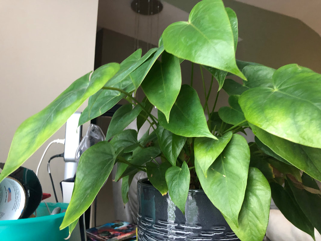
Original Version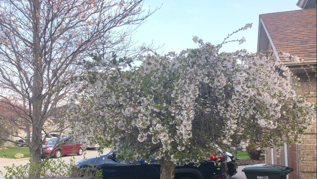
Original Version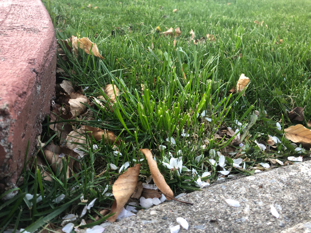
|
Edited Version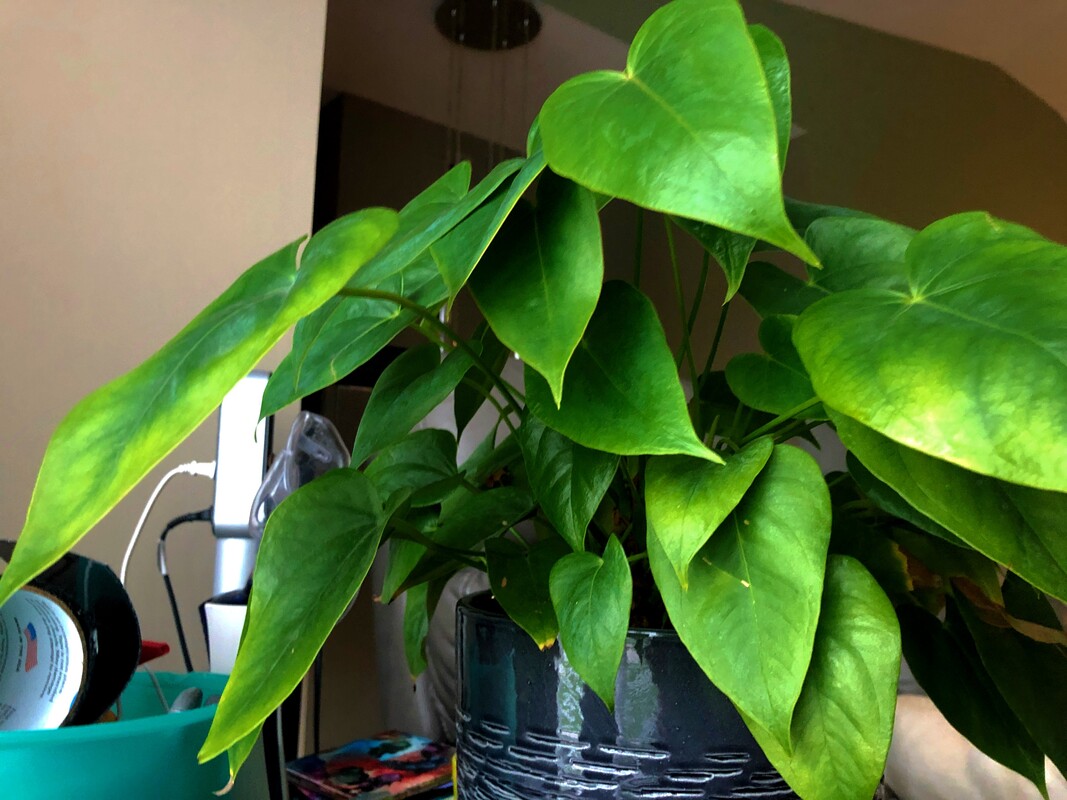
To edit this image, first, I brought the contrast up slightly to 16 to make each leaf stand out more. Next, I brought the highlight all the way down to -100 because I didn't really want the highlight on the leaves but instead, I wanted to show the different shades of green in the image.
Edited Version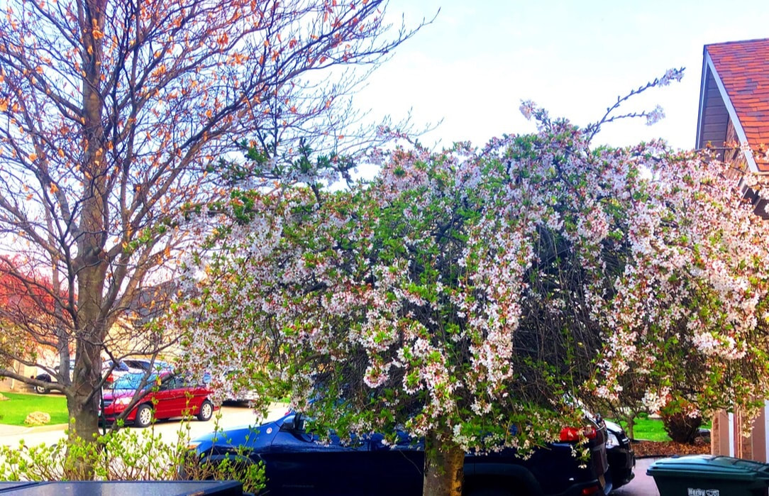
I cropped the image slightly so that the viewer could see less of the truck and so that the tree looked like it was more in the foreground. After that, I started to adjust the image. I brought the vibrancy up to 100 and the saturation up to 36 to make the tree's colours brighter. I also did it so that it could have a more "magical feeling" to it because I think after a cold and blue/ white winter everything springs up and has the airy pink feeling and everything seems more colourful than in reality. Finally I brought the contrast up to 38 to make everything stand out even more, however, since I thought that the branches and shadows were too light still, I brought down the shadows to -54 to darken them.
Edited Version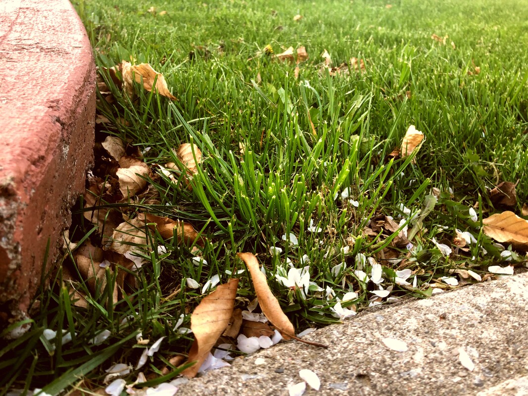
For this picture, I brought the vibrancy up to 24 to brighten the grass and I brought the saturation up to 50 to add a little bit of yellow to it, this makes it look like I took the picture during a sunset which I think, fits the theme well. Then, I brought the contrast up a little to 20 to make all the colours pop even more when next to each other. I think it turned out well because red and green are complementary, and other than those colours, the petals on the ground also seem to contrast the dead leaves from autumn which I also like a lot.
|
