
Original Version
Original Version
Original Version
|
Edited Version
I brought the vibrancy to 100 to brighten the red wood, then, I brought up the white to 34 to brighten the white in the glass, then, finally, I brought the contrast up to 30 to further exaggerate the differences in the image.
Edited Version
I brought the vibrancy up to 84, the saturation to 52, and the temperature up to 26.
Edited Version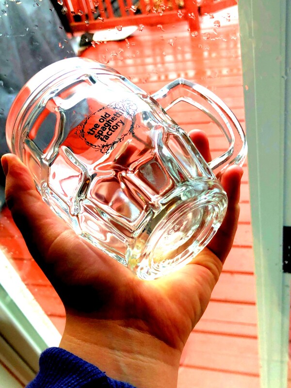
For this image I brought the vibrancy to 48 to make the wood more red, next, I brought the contrast to 20 to make the hand and glass more noticeable. Then I brought the shadows up to 100 so that they were less dark, and finally I brought the white to 46 to make the white in the glass more bright.
|
