
|
1. Leading Lines
|
2. Forced Perspective
|
3. Leaf
|
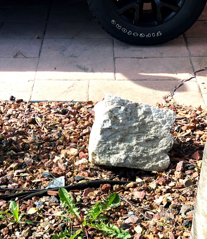
4. Colourful Rock
|
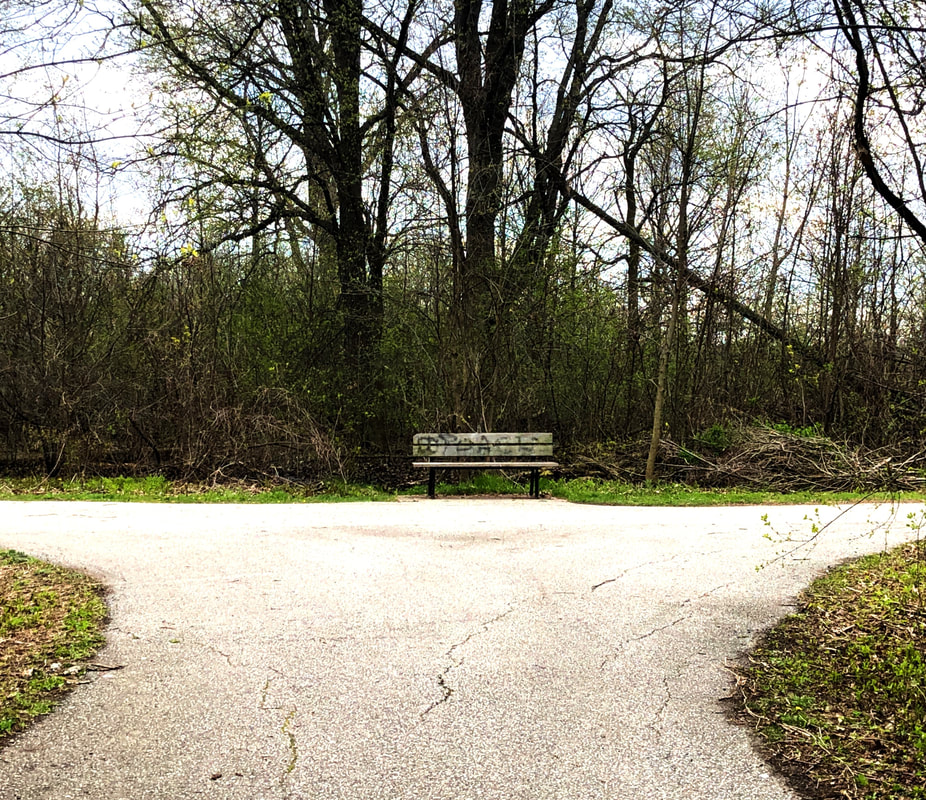
This image was taken in a way as to where the intertwining roads could all lead to the lonely bench in the middle. I think with all of the fallen trees and the grey sky, the picture looks dystopian almost, and makes the bench seem lonelier.
I brought the vibrance up to 42, then I brought the contrast up to 30. Finally, the image was still too light, and all the shadows were too similar. So to add the final touch I made the drastic change to bring the shadows down to -100.
|
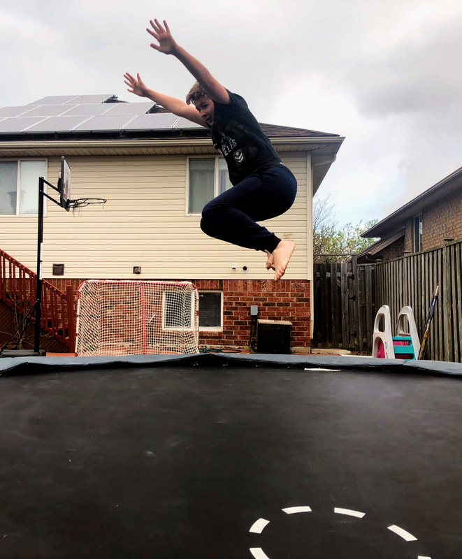
For this picture, I tried to capture the perspective that my brother was jumping on the trampoline. So in reality I had him bounce off the trampoline onto the ground beside it to look more realistic.
Here, I liked the colour already so I only changed the light. First, I lowered the brightness slightly to -10 and brought up the exposure to 18. Then, I also brought up the contrast to 26 and the black to 18. Finally, I had to bring the shadows down to -60.
|
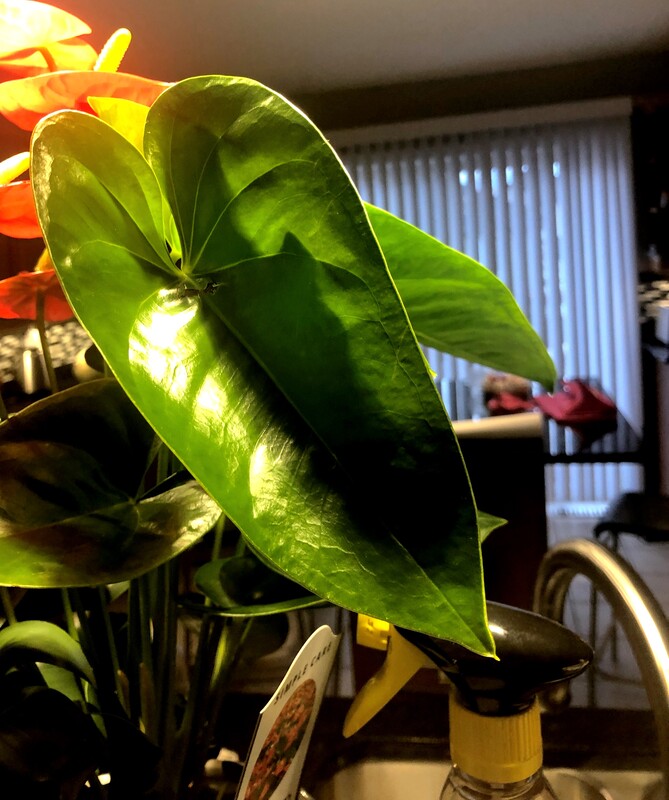
This is a leaf from the flowers that my mom got for mother's day. I took the picture so that it could be shallow depth of field and so that it was the most important thing to look at.
For this, I brought the vibrance down to -26 since I thought all the colours in the room were pretty bright. Next, I brought up the contrast and the shadows to 30 and 64. This made it so that the light above the plant wasn't as bright when it was shining in the picture.
|
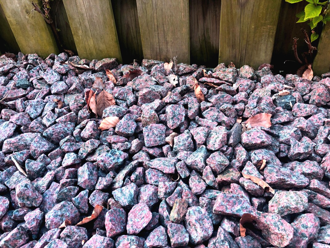
These are some reddish rocks from the rock garden that is on the side of my house. I edited it so that the rocks were slightly brighter because in the original picture, my house casts a shadow over the garden.
For this picture, colour was very necessary. So while the rocks already had their own colour I still needed to adjust it. So first, I brought the saturation up to 52 and the hue down to -19. Next, I brought up the contrast to 24 and brought down the black to -10.
|
|
5. Something Tall
|
6. Something Small
|
7. An Animal
|
8. Nature Selfie
|
While I was walking, I realized how tall the trees were around me and so I thought that it would be a great picture, especially against the bright, blue sky.
I brought up the saturation for this image to 28 to make the colours pop. Then, I brought the contrast down to -20.
|
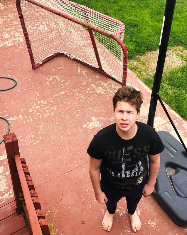
This is a picture I took of my brother after we finished taking the forced perspective picture. I was on the steps of my porch looking down on him to make him look smaller.
For this picture, all I did was bring up the vibrance to 68 to make the red a little brighter.
|
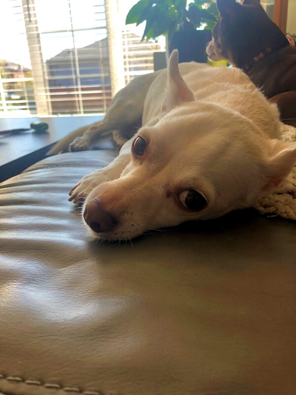
This was a picture I took for fun to send to my friends. I really liked how it looked and I saved it.
Here, I just brought down the higlights to -15 to make the light in the back a little less bright.
|
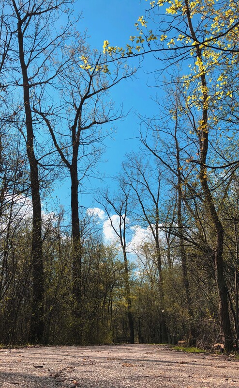
I took this in a nature walk in a sort of park near my house.
I brought up the saturation to 62, then, I brought the temperature down to -28. I brought the contrast up to 28 but it was too dark, finally to lighten the image slightly, I brought the white to 16 and the shadows to 22 to make the image lighter.
|
|
9. Something Rough
|
10. Something Round
|
11. Your Favourite Colour
|
12. A Nature Shaped Letter
|
This picture was taken at the rock garden that separates my house from my neighbour's. I wasn't sure what to do for the image so I took it of this rough texture on the rock. But looking back at it I probably should have taken a shot that was of the texture for the majority of the picture.
Here, I brought up the vibrancy to 52 to make the rocks more colourful. Next, I brought up the contrast to 44, the black down to -16, and the shadows to -22.
|
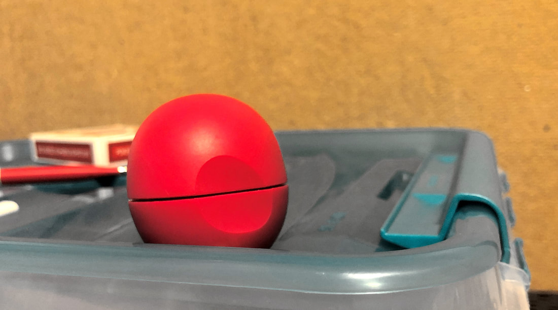
I was at my desk one day working and realized that this container on my desk looked sort of nice compared to holding all of the red items on top of it and decided it would be a good picture for the subject. If I were to retake the picture I would probably be a little more zoomed out though.
I brought down the vibrance to -86 and the saturation to 34 to make the chap stick stand out more from all the other colours in the background. After this, I brought the brightness to 32, and the contrast up to 38.
|
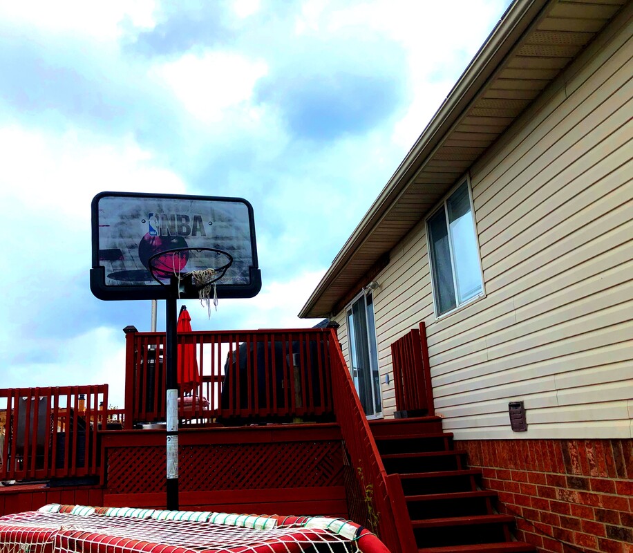
I took this picture after I took the picture of my brother on my trampoline. I looked up and realized I really liked the red and the contrast with the basketball net and the sky.
For this picture, I brought the vibrance up to 98 and the saturation to 20, to make the entire image all red. Afterwards, I brought the contrast up to 44, the shadows down to -32, and the highlight down to -64 because the sky was too bright.
|
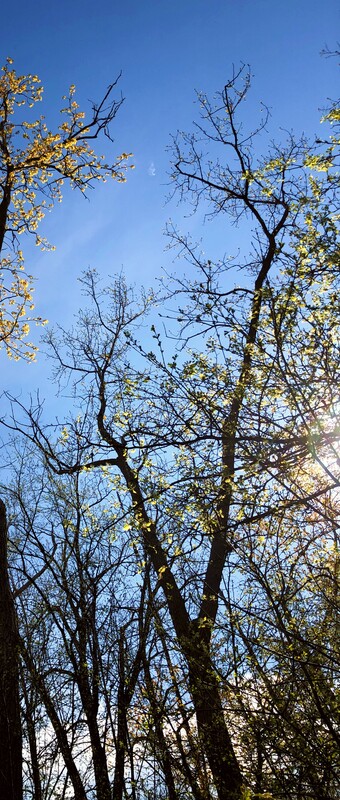
This picture was taken during a walk in the park. I was having difficulty finding a nature shaped letter but then... I looked up! I really like the height in this picture. Its really different to some of the other pictures.
For this image, all I did was bring up the vibrancy to 94 to make the sky more blue. This is because the focus of the image is about the letter and not anything else.
|
|
13. A Feather
|
14. Water
|
15. A Seed
|
16. Something Noisy
|
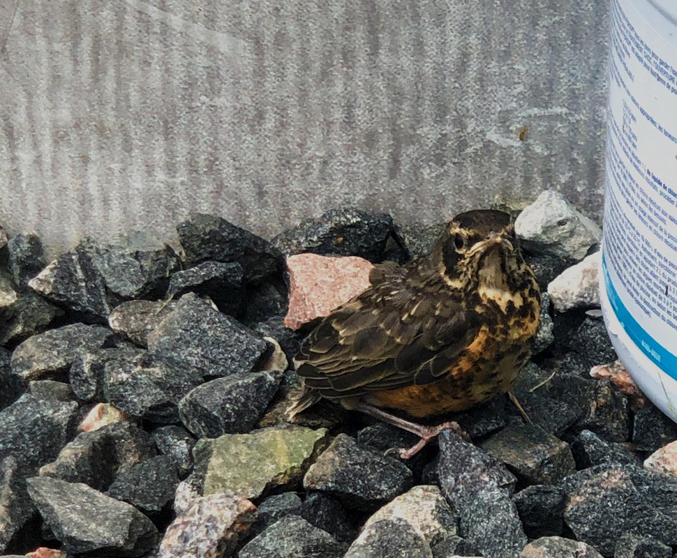
This is a young bird my brother and I found in our backyard. We thought it was pretty cute and look at the feathers!
For this picture, I brought the contrast up slightly to 14, then, I brought the white down to -44 and the shadows down to -34. And I brought the vibrancy up to 68.
|
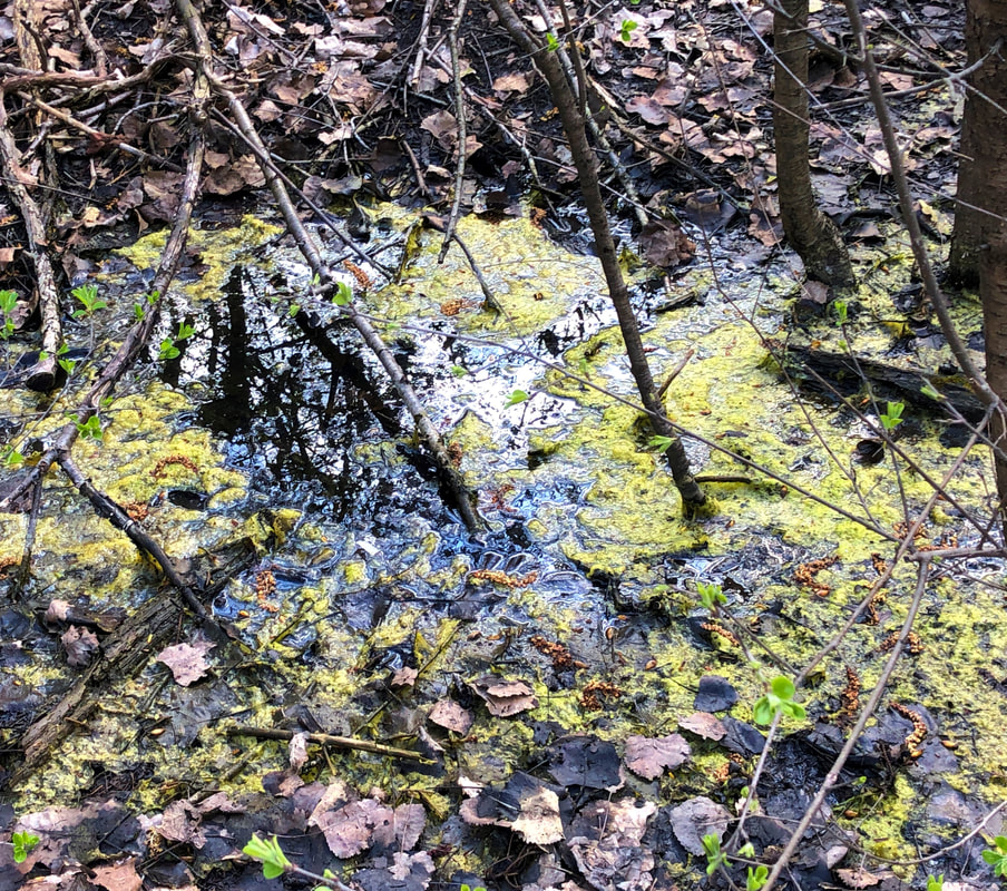
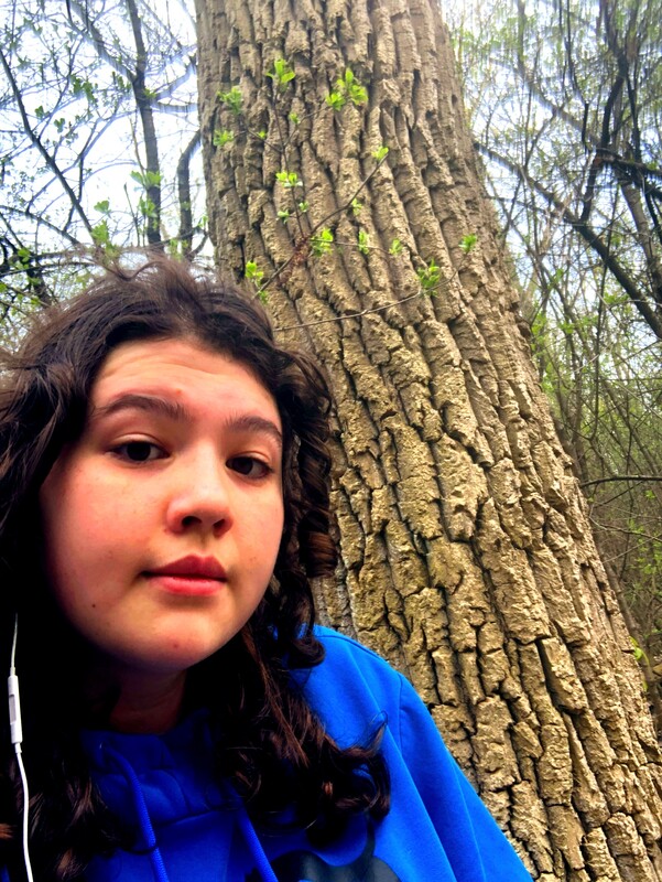
I really liked the reflection in the water in this forest. And surrounded by the moss and leaves is different I believe.
Here, I brought up the vibrance to 44 the saturation to 24, and the highlights down to -50
|
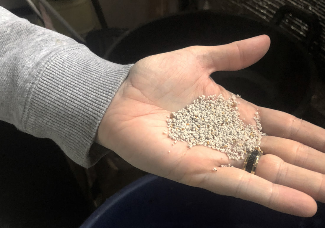
These are some of my dad's grass seeds. I think he killed the grass in the front yard, so there's a reason for it.
Now, with tis picture, I brought the vibrancy down to -46 so that there was less colour in all of the surrounding objects.
|
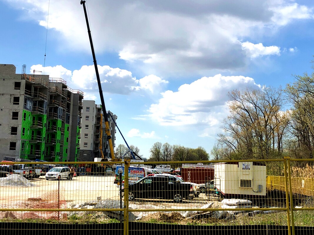
On my walk, in-between the nature walk there was construction for an apartment building and a park. It was pretty distracting when trying to walk through nature.
With this, I brought up the vibrance to 28, to bring out more colours in all of the different objects in the picture. And I brought up the contrast to 36 and the shadows to -26.
|
|
17. A Beautiful Scene
|
18. Dirt
|
19. Bug
|
20. Shallow Depth of Field
|
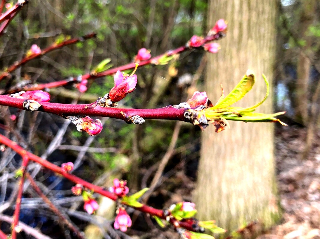
I saw these branches on my walk and thought it looked very nice and really encapsulated the idea of springtime. I originally thought this should be used for shallow depth of field, but then after editing it, I realized that it was my favourite picture of the bunch.
For this picture, I brought up the saturation to 60, brought up the highlights slightly to 22, and brought up the contrast slightly to 16.
|
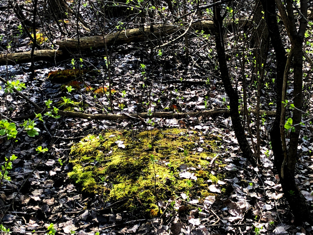
This is another set of moss that I found. To me the idea of just shooting some dirt or grass sounded dull, so I thought the dead land around the moss was a little bit more interesting.
For this picture, I brought up the vibrancy to 42 to make the moss brighter. Them, I brought the contrast up to 20, the black down to -22 and the shadows up to 20.
|
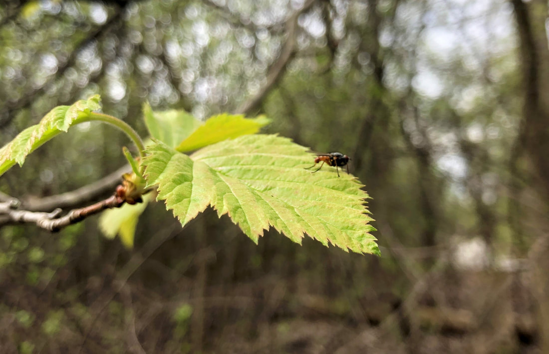
For me, it was kind of hard to find a bug, but that makes sense since they are small. But, while I was biking around I found this bug sitting on this leaf. As I moved closer, it didn't fly away so I managed to take a pretty good picture.
Here, the main thing I did was bring up the vibrance slightly to 28. Then, I made a few more slight adjustments to the highlights, I brought it up to 20.
|
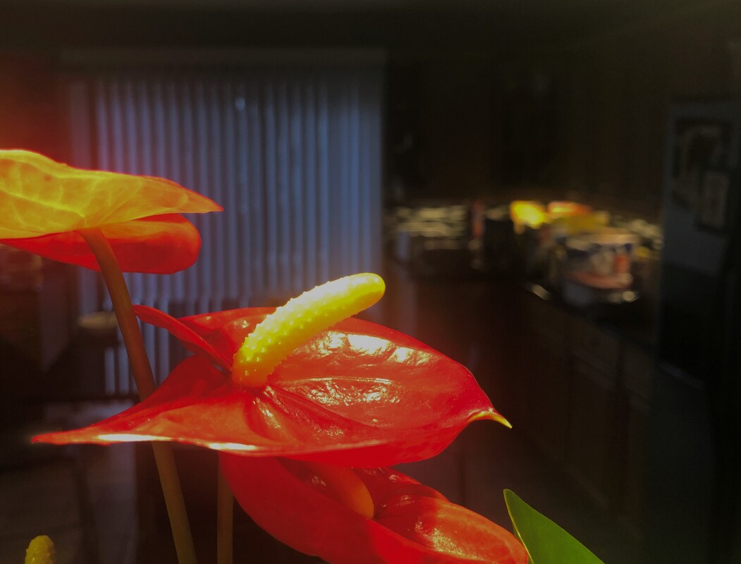
These are flowers that my dad bought for my mom for mother's day. I thought that they were really different to other flowers that we typically think of and I like them a lot.
All I did for this picture was adjust the lighting. First, I brought the brightness down to -18, then I brought the highlights down significantly to -92. Finally, I brought the shadow down to -20.
|
