
Original Version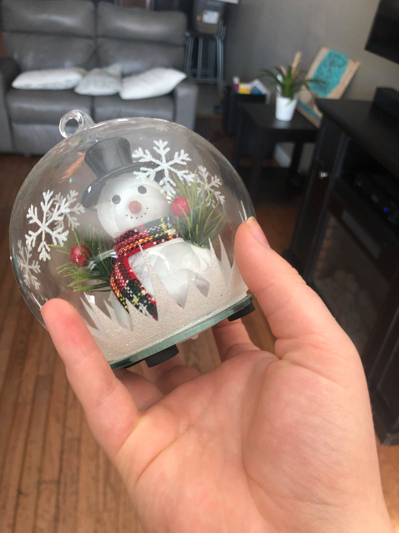
Original Version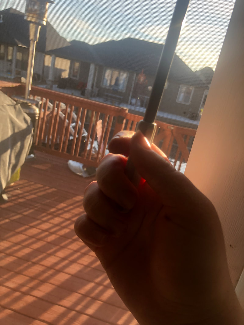
Original Version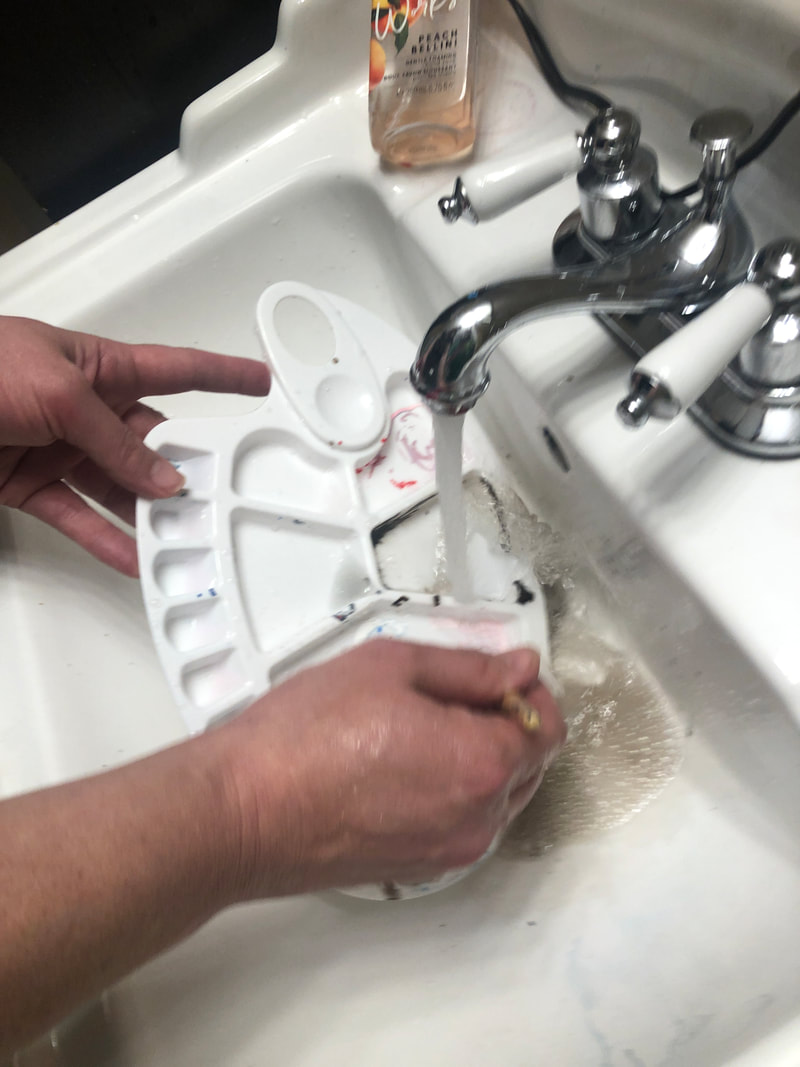
|
Edited Version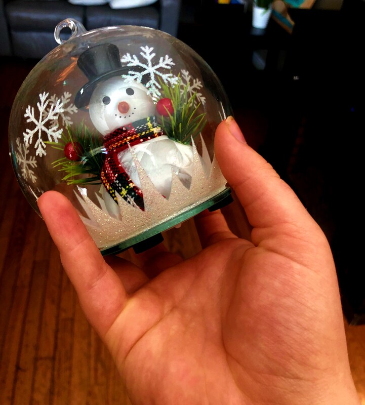
I cropped the image slightly to put a little more focus on the hand. Then, I brought the saturation up to 100 so that the entire image hand more colour, and so the hand could show more texture. Afterwards, I brought the contrast up to 50 so that I could have the hand stand out even further. Finally, I brought the shadows down to -60 to make the hand even more to make the background and underneath the snowman even darker.
Edited Version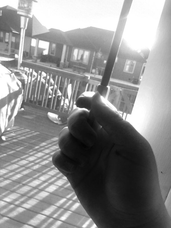
First, I made the image black and white to make the hand stand out because I thought the red of the wood was distracting. Then, I brought the highlight up to 30 to make the hand and the sun have more brightness to compare to the dark hand.
Edited Version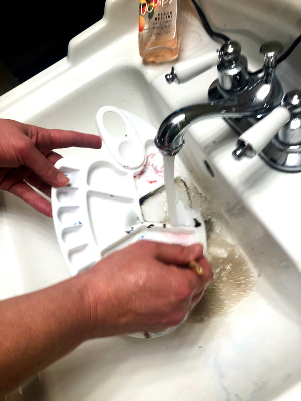
First, I brought the vibrance up to 50 so that the hand could be more bright compared to the white sink and so that it would be the first thing you see in the image. Then all I had to do was to bring the contrast up to 24 to make the hands stand out slightly more.
|
